PETICO

A mobile app for purchasing premium, organic pet food and toys with same-day delivery or in-store pickup, designed for pet owners who want ultimate convenience without compromising on quality.
Mobile App
UI Design
Social Impact
Ux Research
Project Overview
What is Petico?
Petico is a mobile commerce app designed for pet owners who demand 100% organic ingredients, with zero artificial additives or fillers. Every product is thoughtfully curated and fully transparent, with same-day delivery or in-store pickup.
My Role UX/UI Designer
Platform Mobile App
Tools Figma
Timeline 8 Weeks
Healthy pet food is hard to get fast.
The Problem
Health-conscious pet owners are underserved by today's retail options. Supermarkets stock mostly conventional brands. Specialty stores keep limited, inconsistent hours. Major online retailers take 2–5 days to deliver, burying premium choices under hundreds of low-quality alternatives.
The result. Dedicated owners settle for last-minute compromises they feel guilty about or spend 45+ minutes researching before they can buy anything at all.
Ingredient transparency buried in the fine print
Lack of same-day fulfillment from a premium only catalog
No centralized destination for truly organic pet food
Existing apps prioritize volume over curation
The Goal
What Petico set out to solve.
Every product hand picked for quality
Never volume over value
Full Transparency
Ingredients, sourcing, and certifications shown upfront, no fine print .
Same-day fulfillment
Deliver or ready for pickup the day you order, every time.
Catalog
A fully organic, additive-free catalog ,curated food and safe toys only, with nothing to filter through.
Understanding the User
Who shops on Petico?
Sarah M.
Dog Owner 34 Marketing Manager , Orlando
Goals
Find organic kibble without spending hours researching
Get reliable same-day delivery after work
Frustrations
Waiting days for a delivery window
A reordering process with too many steps

Marco R.
Cat Owner. 28 Freelance Developer · Miami
Goals
Find grain-free, chemical-free cat food he can trust
Get reliable same-day delivery after work
Frustrations
Unclear or hard-to-find pickup location hours.
Inability to save favorite items for quick reordering.
Product descriptions cluttered with confusing industry jargon.

Research Insights
82%
Of pet owners read ingredient list before buying food
3 in 5
prefer same-day over next-day delivery for pet essentials
71%
prefer same-day over next-day delivery for pet essentials
The screens
High Fidelity Design
A warm, minimal interface that leads with curated products and honest ingredients and keeps same-day fulfillment one tap away.
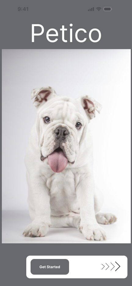
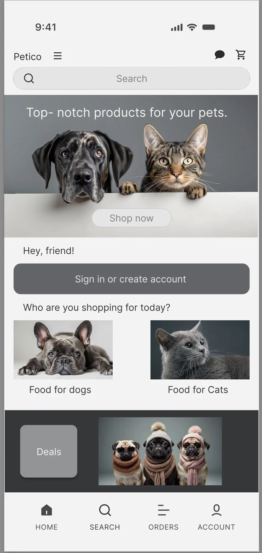
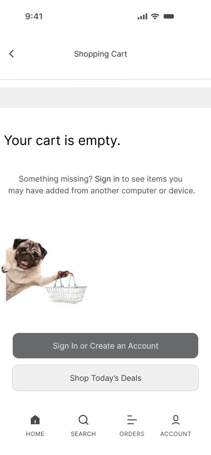
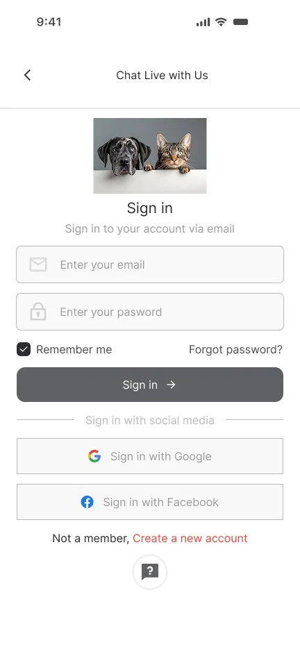
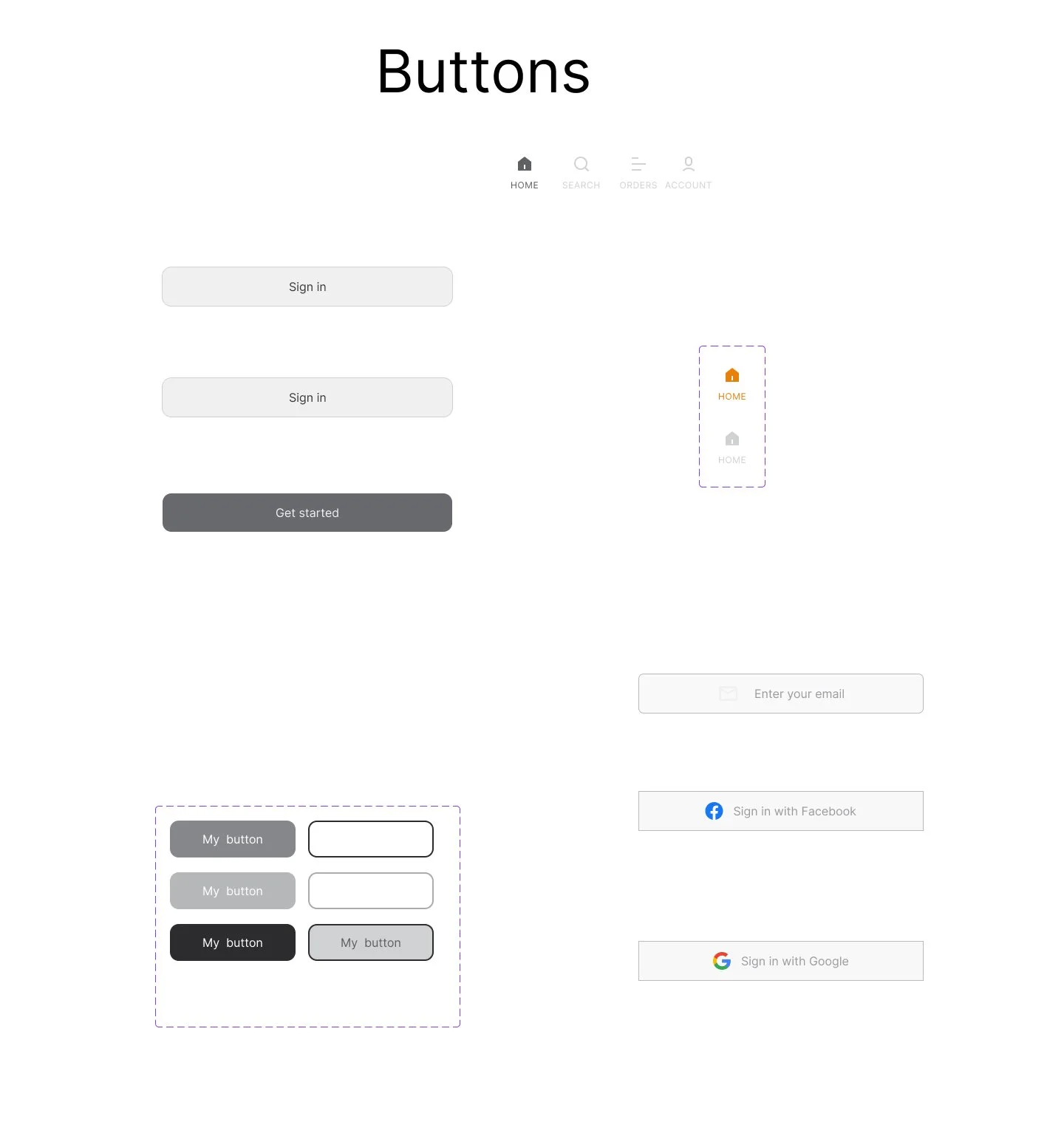
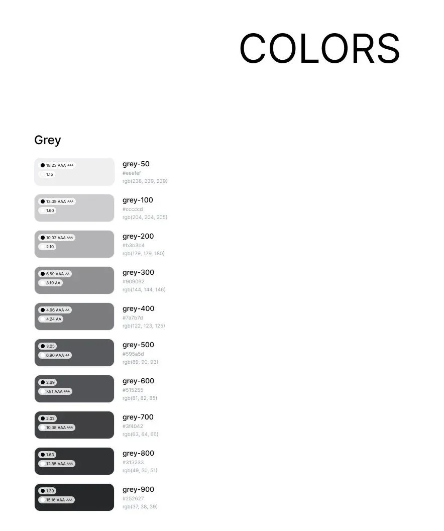
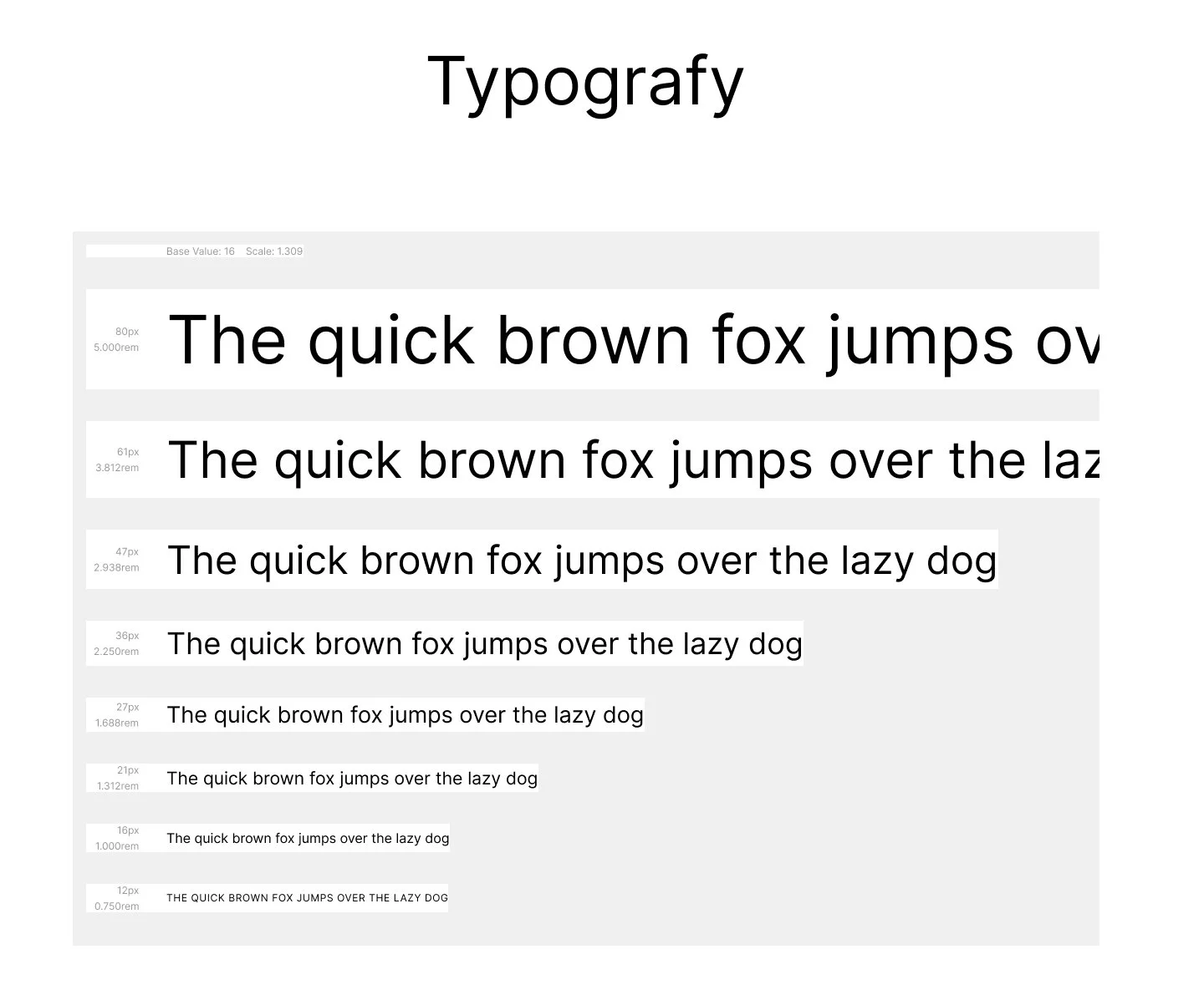
Design System
A warm, product-first design system that makes healthy pet food easy to trust and fast to order.
Petico required a unified design language from catalog to checkout. Color is kept intentional and minimal, allowing vibrant food photography to lead the experience. A clean sans-serif typography handles prices, dietary tags, and actions, while product cards keep ingredients, pet types, and delivery times constantly visible. Primary CTAs remain direct and action-oriented: 'Add to order' or 'Get it fast.' By maintaining consistent design tokens throughout, browsing and buying feel like one seamless brand.
Usability Findings
What testing revealed
Positive
Certifications built trust instantly
Organic badges on the landing screen raised confidence and shortened time-to-purchase.
Medium
No side by side comparison
Shoppers wanted to compare two foods by ingredients. Added a quick-compare toggle.
High Priority
Delivery ETA hidden until checkout
Users hesitated to add items without knowing when they'd arrive. Surface live ETA on the product card.