BiteBack
Turning local surplus food into meals for people in need, safely, quickly, and with dignity.
Ux Research
Mobile App
Social Impact
UI Design
Project Overview
What is BiteBack?
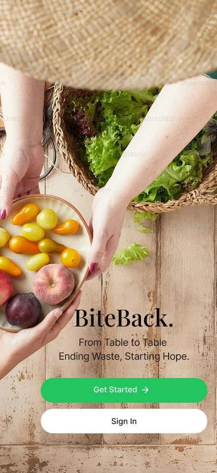
BiteBack is a two-sided marketplace that redistributes surplus food. Businesses list what they can't sell, and people nearby reserve it for free, turning up to 40% of wasted food into meals while preserving dignity on both sides.
Designed as a mobile app, BiteBack makes the whole process simple: businesses post surplus in seconds, and people browse, reserve, and pick up nearby meals through a clear, respectful experience. Every step is built to be fast, safe, and free of stigma, so getting food feels as natural as ordering it.
Platform iOS/Android
Timeline 8 Weeks
My Role UX/UI Designer
Tools Figma
The Problem
Two crises. One solution.
Restaurants and supermarkets throw away enormous amounts of edible food every day, while 6 in 8 Americans face food insecurity. The two problems rarely meet because the tools to connect them are broken.
For businesses, donating surplus food is too complex. It means coordinating with nonprofits, navigating logistics, and finding time during busy hours, so most food ends up in the trash. For recipients, the experience often comes with stigma, long lines, and little control over what they receive.
Any solution has to do two things at once: move food quickly and protect dignity on both sides.
No simple way for businesses to list surplus food quickly
Recipients face stigma UX must preserve dignity
No real-time inventory of surplus food by location
No Food safety concerns on the recipient side
The Goal
Three outcomes BiteBack had to deliver.
Trust on both sides
Quality checks, clear pickup windows, and pickup confirmations give businesses and recipients confidence at every step.
Dignified access
Recipients browse and reserve as easily as on any food app, with no stigma, no questions, and no account required.
Zero-friction donation
Businesses can list surplus food in under 60 seconds, with a few taps and no paperwork.
Understanding the User
Two sides of the same table.
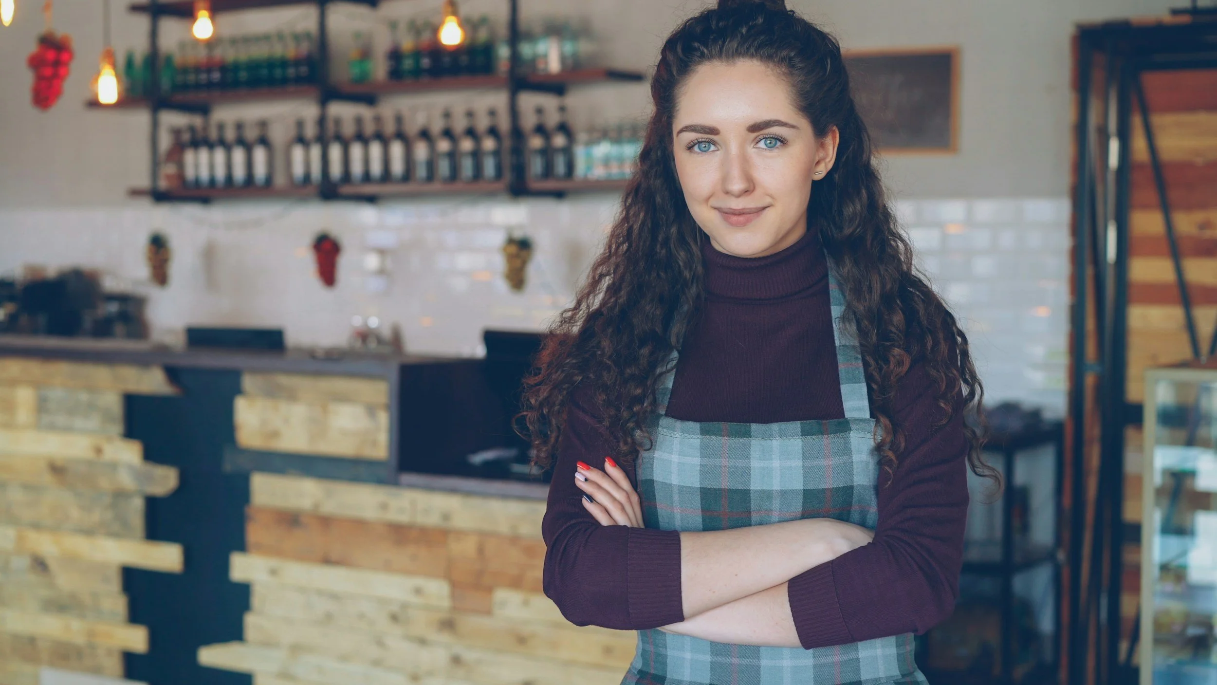
Olivia R.
Restaurant Owner
44 · Restaurant Owner · Miami
Goals
List surplus food in under a minute
Track who collected it and when
Reduce food waste and the guilt that comes with it
Frustrations
Donation form has too many steps
No confirmation that the food was collected
Liability concerns about food safety
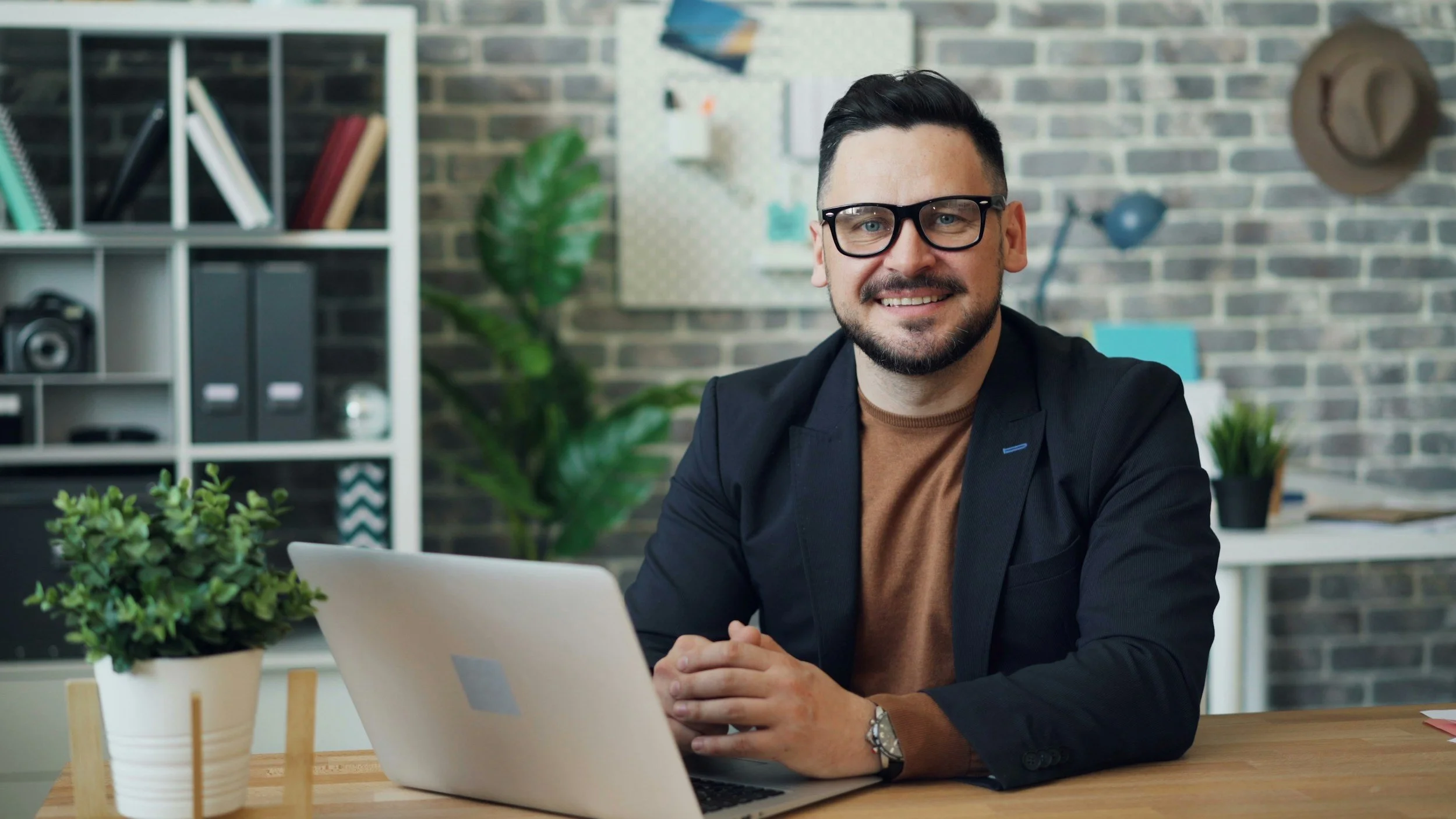
Zayme R.
Recipient 28 Part time worker , Orlando
Goals
Reserve with one tap, no account required
Quickly find surplus food near him
Pick up without awkward interactions
Frustrations
Pickup window not visible on listing card
No map link after reserving
Unclear what's included before he arrives
Research Insights
78%
Of guests check a café's menu online before visiting
6 in 8
Americans face food insecurity, often just miles from businesses discarding edible food every day
3 of 5
businesses abandoned the donation form before finishing
The screens
High Fidelity Design
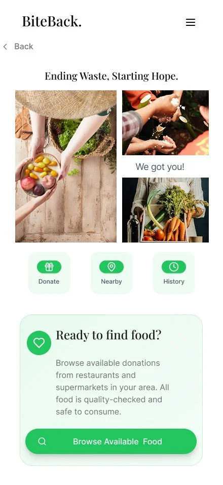
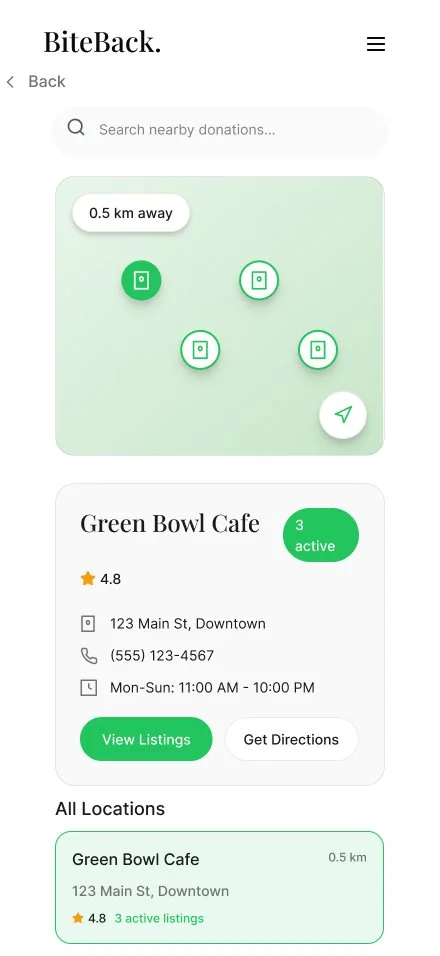
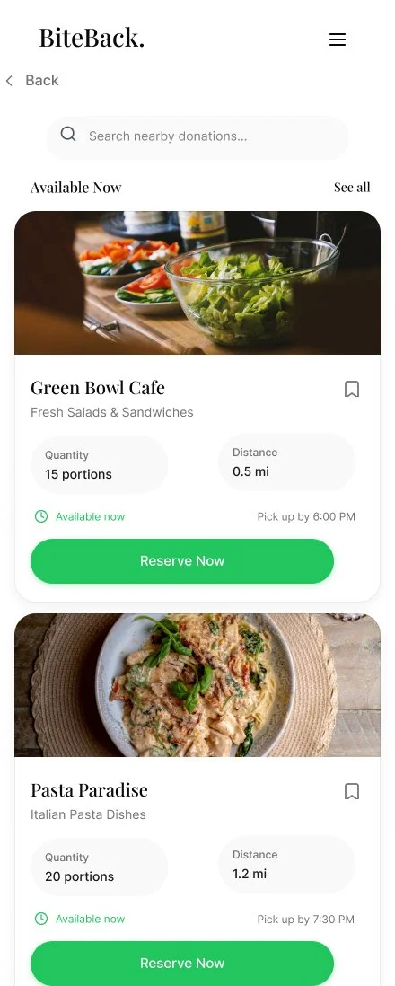
A friendly, food-forward interface makes reserving a meal feel as natural as ordering one, and donating as quick as posting a status update.
Design system
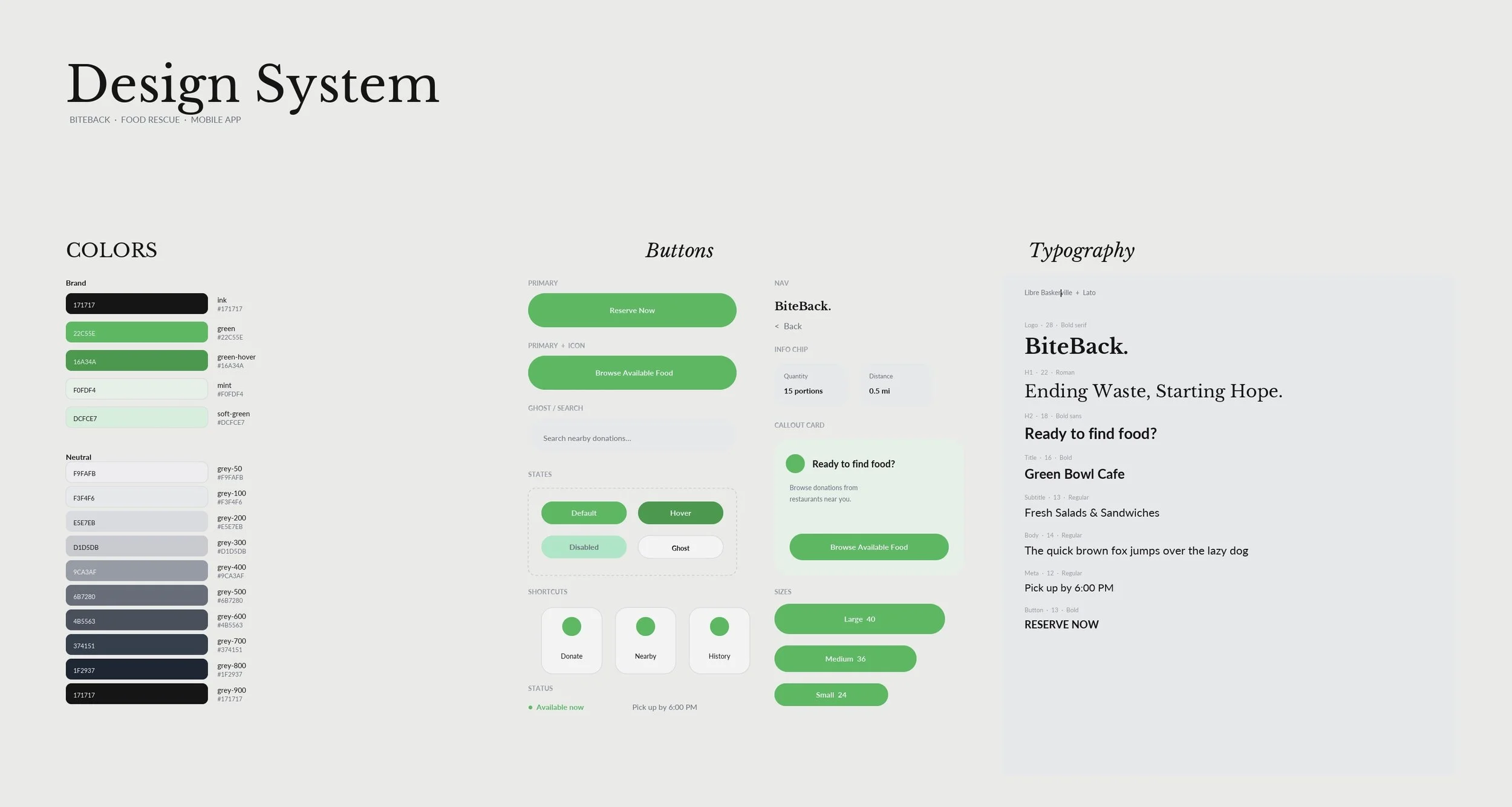
A clean, high-trust system built to turn surplus food into a reservation in just a few taps.
BiteBack needed one consistent language, from the home screen to Available Now. The food photography does the selling, so the interface only has to make distance, quantity, and pickup time obvious. Color is limited to ink, white, and a single green, used for actions and the "available now" status. Headings stay editorial, while UI, cards, and buttons use a clean sans-serif. The primary CTA is always the same: Reserve Now. Shortcut chips (Donate, Nearby, History), search, and mint callout cards all reuse the same tokens, so the app feels like one product, not a set of disconnected screens.
Usability Findings
What testing revealed
Positive
One-tap reserve preserved dignity
No-account reservations made recipients feel like ordinary customers, and it was the top-rated interaction.
Medium
Long donation forms
Owners abandoned the form midway. Reduced it to 3 steps with smart defaults and photo capture.
High Priority
Pickup Window missing information
Recipients couldn't tell if they'd make it in time. Added the pickup window directly to each listing card.