REFRESH
A clean, modern platform for a refreshing café. Browse our selection of healthy desserts and ice cream, and place your order online seamlessly

Mobile App
Social Impact
UI Design
Ux Research
Project Overview
What is Refresh?
Refresh is a healthy café known for wholesome desserts and refreshing ice cream. The website translates that light, fresh personality into a digital experience—showcasing the menu, telling the brand's story, and making it effortless to order a treat or locate the café.
Tools Figma
My Role UX/UI Designer
Platform Website
Timeline 8 Weeks
The Problem
A fresh brand with nowhere to shine online.
People loved the wholesome desserts and refreshing ice cream in person, but online presence was limited to scattered social media offering no full menu, no prices, and no way to order ahead.
Regulars who wanted to check flavors, dietary info, or hours before visiting had nowhere reliable to look
Lack of a centralized website to showcase the full menu and transparent pricing
Dietary and ingredient information was difficult to locate.
No digital capability to place online orders or reserve treats in advance.
The brand’s fresh, healthy identity was not reflected in its digital presence.
What the Refresh site set out to solve.
The Goal
Appetizing Menu
Present desserts and ice creams with mouth-watering photography and clear, honest pricing.
Healthy transparency
Surface ingredients, dietary tags, and nutritional cues so health-conscious guests can choose with confidence
Easy Ordering
Make it effortless to order for pickup, find the café, and check opening hours in a few taps
Understanding the User
Who visits Refresh?
Cristina R. Health-Conscious Regular 29 · Yoga Instructor · Miami
Goals
Find guilt-free desserts with clear ingredient info
See which options are vegan or low-sugar at a glance
Order ahead and pick up on her way home
Frustrations
Menus that hide ingredients
Not knowing prices before arriving

Maria G.
Weekend Visitor. 34 · Graphic Designer · Miami
Goals
Discover new refreshing ice cream flavors
Check the café's hours and location quickly
Frustrations
Sites that don't show the full menu
No photos of the actual products

Research Insights
70%
of guests check a café's menu online before visiting.
3 in 5
want clear dietary and ingredient info for desserts
64 %
would order treats ahead for pickup if it were easy
The screens
The Website
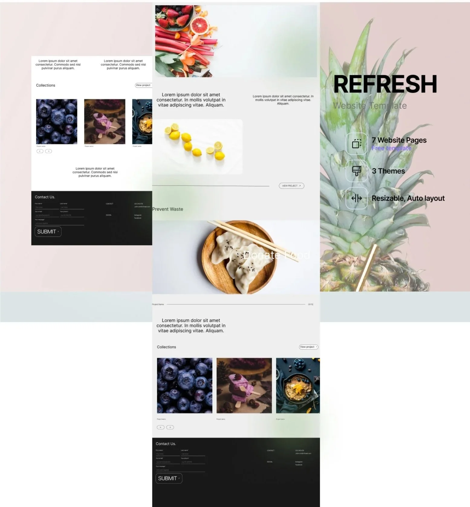
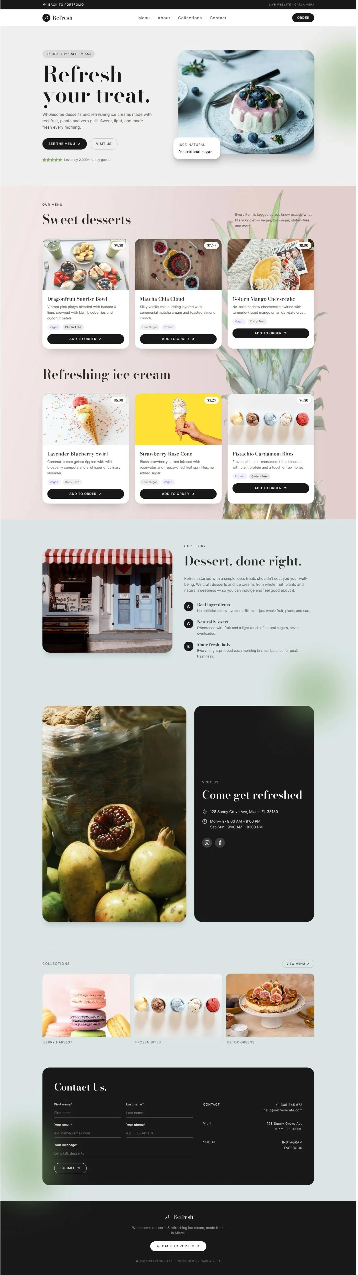
A light, clean layout with generous whitespace and vibrant product photography makes the menu feel as refreshing as the food, with ordering and location details always within reach
Design System
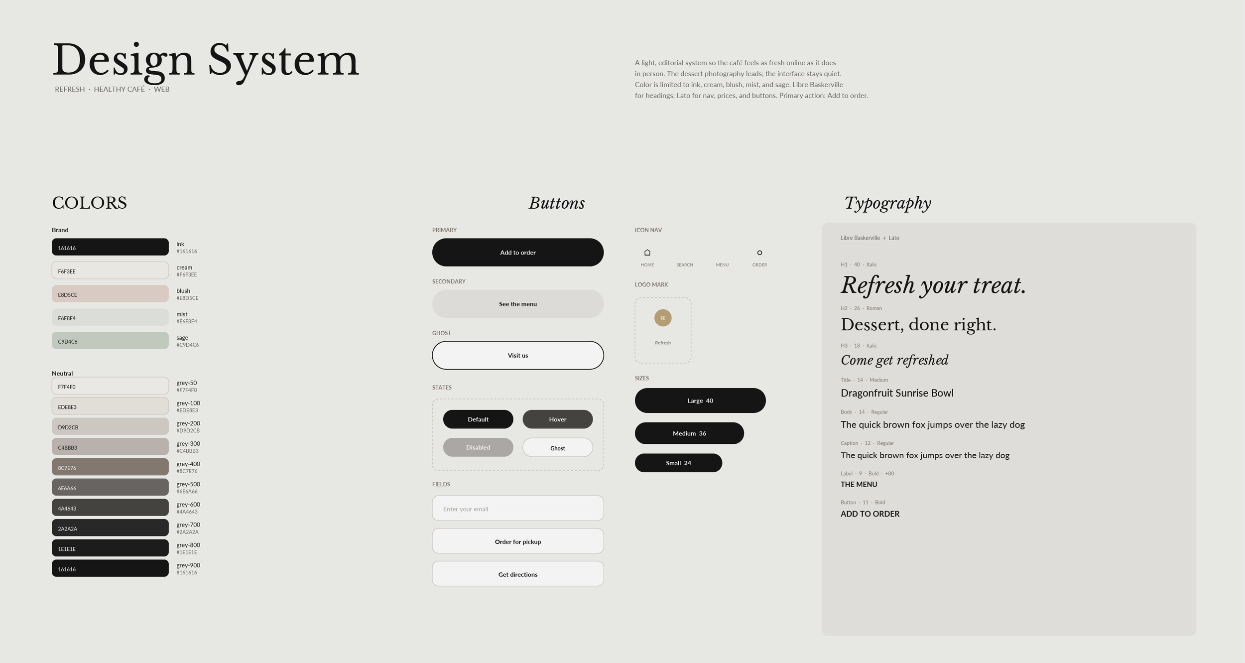
A light, editorial system so the café feels as fresh online as it does in person. The photography leads, the interface stays quiet. Color is limited to ink, cream, blush, mist, and sage. Libre Baskerville is used for headings to set a calm, magazine tone. Lato is used for navigation, prices, and buttons so the menu stays easy to read. The primary action is Add to order.
Usability Findings
What testing revealed
Positive
Product photography drove cravings
Product photography drove cravings. Full-bleed dessert and ice cream imagery was the top-rated element, visitors noted it made them want to order right away.
Medium
Menu grid felt crowded on mobile Cards were too tight on smaller screens, so we loosened the spacing and simplified the layout to a single-column scroll for mobile devices.
High Priority
Dietary tags were easy to miss Health-conscious guests couldn't quickly spot vegan or low-sugar items, so we introduced clear, color-coded tags on every menu card.