The portrait Co.

Designing a unified portfolio, services, and booking experience for creative photographers.
Webpage
Bookings
UI Design
Ux Research
Usability Testing
Project Overview
One place for portfolio packages and contact.
Photographers manage portfolios, pricing, and inquiries across four disconnected tools, and lose clients along the way. The Portrait Co. unifies everything in one clean, editorial experience that converts visitors into bookings.
Timeline 6 Weeks
My Role UX/UI Designer
Tools Figma
Platform Webpage
A scattered presence loses clients before they reach out.
The Problem
Clients need to evaluate styles, understand packages, and book quickly. When these steps are scattered across different platforms, momentum dies and inquiries drop off.
“I can never find a photographer's prices, so I just move on.” Research participant, prospective client.
Portfolio, bookings, and pricing spread across 4 tools
Clients ghost after asking for a rate card via email
No way to check availability before making contact
Websites rarely show clear pricing upfront
The Goal
A clean editorial experience that convert visitors into clients.
Clarify Offers
Transparent service packages and pricing designed to be effortless to find
Showcase Work
A curated, filterable portfolio designed to let the photography speak for itself.
Enable Booking
Effortless inquiries and bookings, leaving zero room for guesswork
Understanding the User
Two perspectives one experience
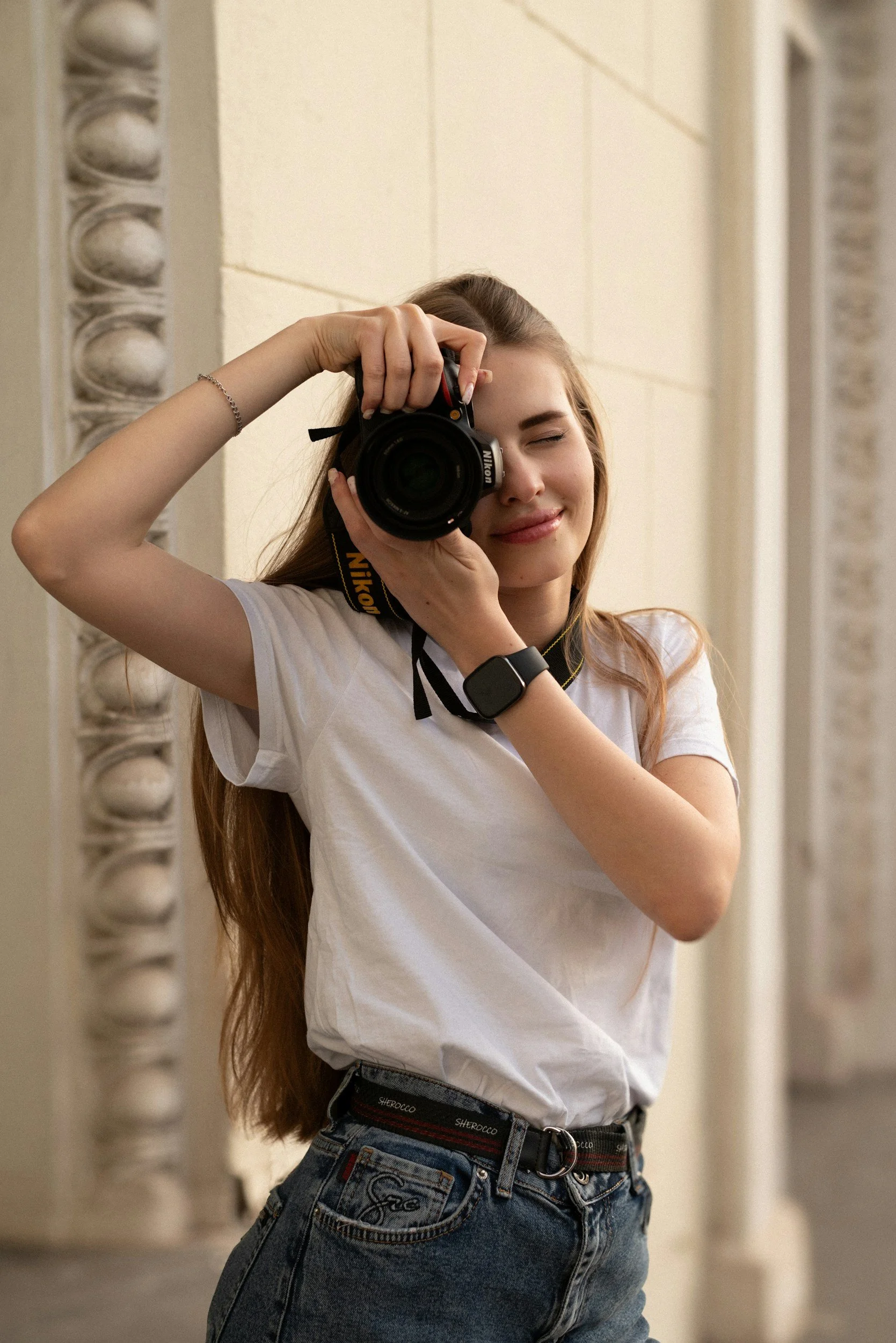
Alexia P.
Freelancer Photographer
34 Portrait, landscape & street . Miami FL
Goals
Build a cohesive digital presence matching her high-end photography.
Optimize client onboarding to cut down on administrative email loops.
Leverage clear pricing to filter and attract qualified leads.
Frustrations
Fragmented workflows spread across four separate platforms.
High drop-off rates when prospective clients have to ask for pricing manually.

Marvin R.
Creative Director
28 · Hiring for personal branding . Miami FL.
Goals
Quickly evaluate a photographer's portfolio and unique style.
Understand what is included at each price point.
Book or inquire seamlessly without jumping between platforms.
Frustrations
Photographer websites rarely display clear pricing upfront.
Lack of a way to check availability before making contact.
Research Insights
2
Test Rounds
10
Usability sessions
8
Users interviewed
The screens
Designed for editorial quality at every scroll.
Clean typography, generous white space, and full-bleed photography put the work first.
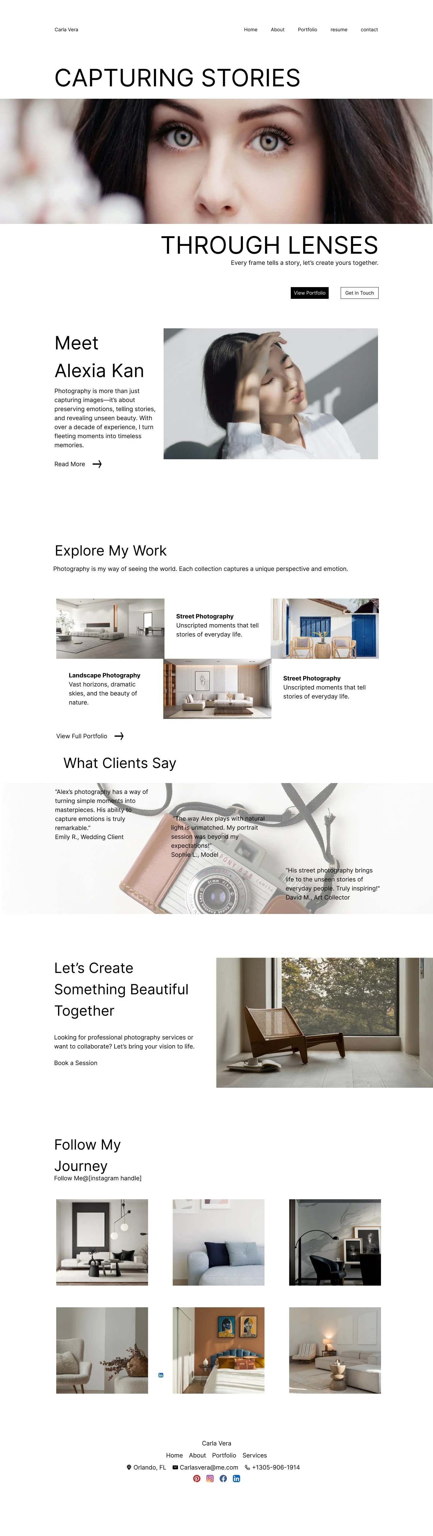
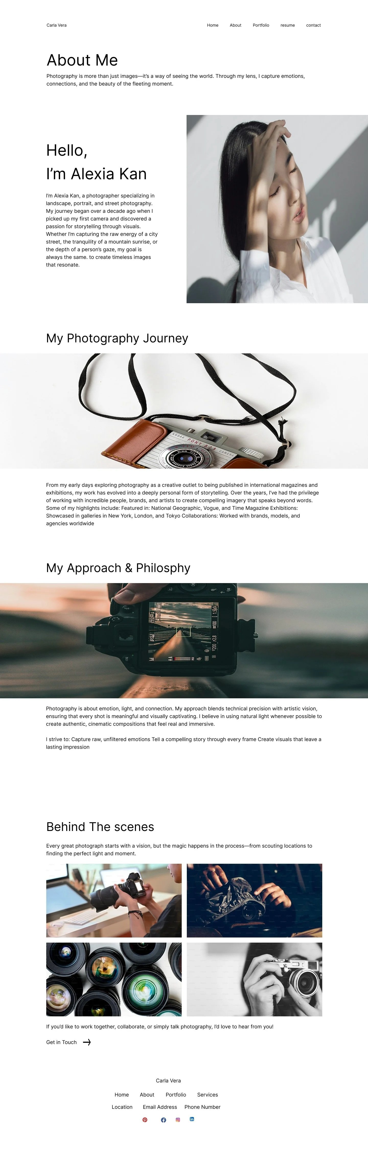
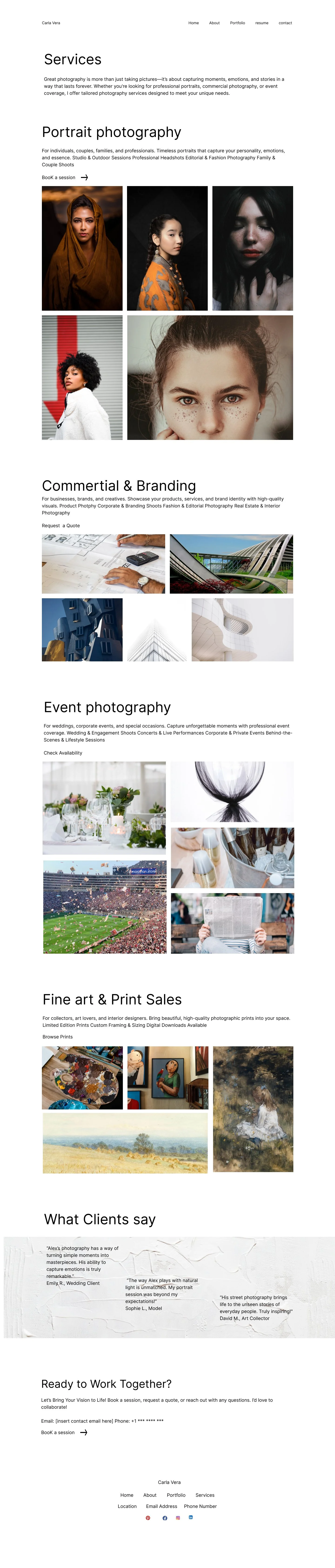
Design System
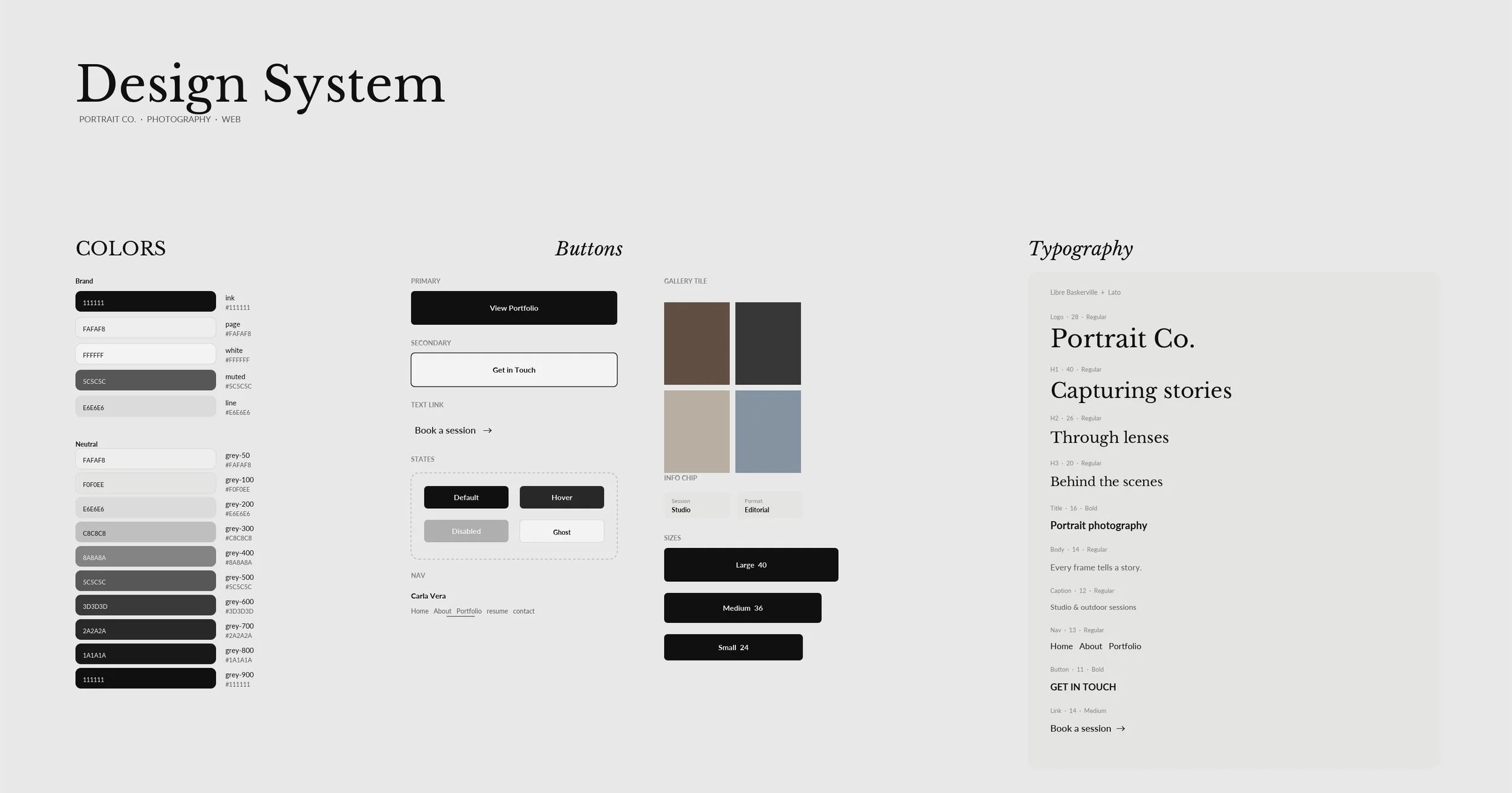
An editorial design system that keeps photography front and center. The color palette is restricted to ink and a warm page tone. Libre Baskerville carries the headlines, while Lato handles navigation, captions, and actions. The primary conversion path features a simple text link: Book a session
What testing revealed
Positive The About page drove booking intent
Users who visited the About page reported a higher likelihood to book, so we surfaced a direct link right from the hero section.
Medium Service packages were impossible to find.
All 10 participants failed to locate pricing without prompting, so we added a dedicated Packages section to the navigation.
High Priority Booking button had no visual priority
7 out of 10 users scrolled through the entire page without interacting with the booking button. To fix this, we transformed it into a sticky, high-contrast call to action.